
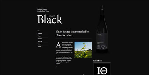
This design is clean and minimalist, which I always tend to gravitate towards. The black background, though a little close in tone to the wine bottle, gives a sophisticated feel which is very appropriate for the subject matter.
This design is simple while still nicely incorporating some image and a bit of color. I like that the header box is highlighted, having image and an overview of what is being promoted- while the details follow.

This design is simple but still has color to catch your attention, as well as animation.

This design gives off the feel of the festival being promoted without being too image heavy, and still feeling organized. An overview is provided as well as immediate access to ticket prices without having to further search their website.

No comments:
Post a Comment